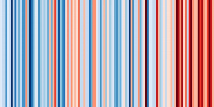
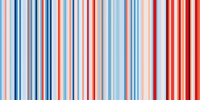
 The new Canadian flag? Not exactly. But there's a key message about the country hidden in those bars... (#ShowYourStripes)
When discussing climate change, one of the most challenging things to communicate is context. So we get questions like...
What do you mean it's getting warmer? By how much? Over how long? Can you show me?
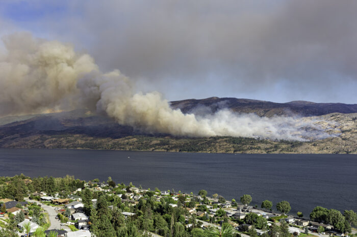
Whether these questions are skeptical or just honest, let's face it: Much of North America has just experienced two of the most bitterly cold winters in recent memory. (Hello, polar vortex!) So the question Are things getting warmer? at least has some reason to come up.
If only someone could just, you know, map it all out. Colourfully!
Okay, how's this?
What am I looking at?
This is the work of University of Reading climate scientist Ed Hawkins. In May of 2018, he created this simple image — it's a graph of 168 lines representing the global average temperature for the years 1850 to 2018. Each line was given a colour based on its temperature. The coldest years were dark blue. The hottest, dark red.
Many were very grateful for Hawkins' work. Finally, instead of a bunch of numbers and charts, there was a simple illustration of how the last 20 – 30 years on Earth have been much hotter than the previous century or so. And now?
Hawkins has taken his idea much further...
Bars and Stripes
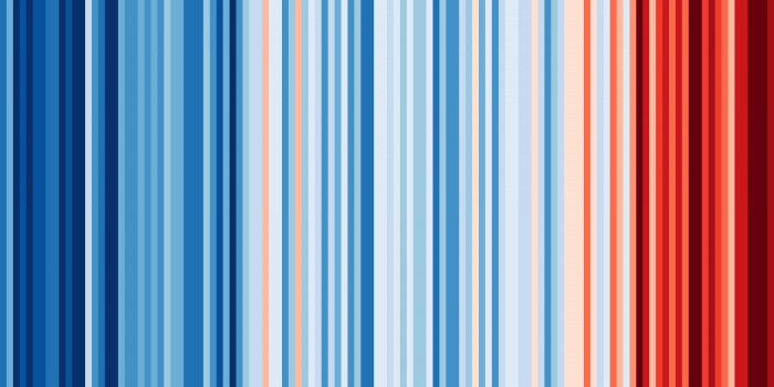
His new interactive website, #ShowYourStripes, allows people to view these bars region by region, country by country, and (in the USA's case) state by state. In most cases, the graphs begin in 1901 and continue to the present day. Canada's is at the very top of this post.
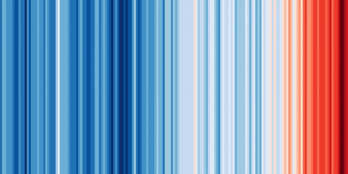
Here's the USA.
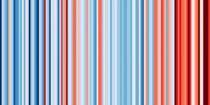
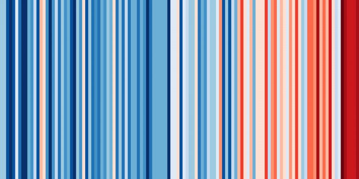
Here's Senegal.
Let's talk about it
One of the best things about this website is that it can help to start constructive conversations of how the climate is changing. Like how?
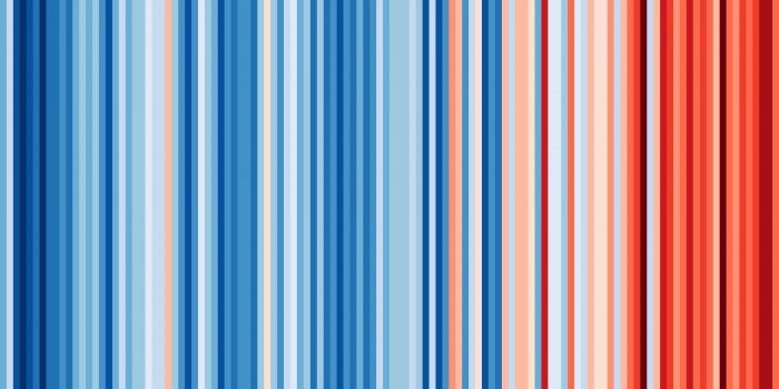
Let's say that you are talking to someone who grew up in New York State, and they say something like, "We had some pretty hot summers back when I was growing up and no one worried about climate change then."
So the two of you punch in: North America, USA, New York to #ShowYourStripes and have a look together...
And hey! Just as they remember, there were definitely some really hot years in the past in New York. In fact, the state has a lot of varying temperatures, right? But then, you could look at, say, China...
Or Australia...
And then go back to the world's chart.
Suddenly, it's a lot clearer.
This summer, give the gift of context!
No matter how much any of these graphs change in their first 100 or so bars, they all finish similarly: darker and darker shades of red. And in some cases — like China — the temperature increases in the last decade have been especially dramatic.
So while some may feel that things haven't changed much where they happen to live (and they might be right), around the world, the colors tell a very clear story. Helpful, right?
Thanks, Prof. Hawkins!


Hey this a great way to show climate change…now if we could only change and/or reduce our consumption of fossil fuels. Insightful as always Prof. Hawkins!! ❗ ❗ ❗ ❗
The atmosphere is a mess 😥 😥
For those of us who benefit from visual learning techniques, this becomes very clear.
It’s scary, but clear. It makes me want to do more and learn more about what the people of the world need to do to slow this down. Who is sending this to the ones in power? Thanks
Such a nice way to show climet change 🙂
How far back can you create these stripes for?
The world is hot
To hot
I think that is a good way to show climate change