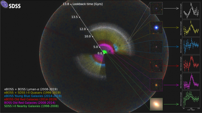
 The flat version of the universe map. Each dot is an entire galaxy! (Anand Raichoor, EPFL/Ashley Ross, Ohio State University/SDSS Collaboration)
Maps. Whether on our devices, in a car's GPS, or the old fashioned paper kind that you lay out on a table, they are crucial to us human beings getting around without getting lost.
And maps have their own beauty, too. Even looking at a map of a place you may never visit is fun. The possibilities! The new locations! What awaits you there? It's all fun to think about.
Usually when we think of maps, we think of using them to get to places on Earth. But if you want to talk about beautiful maps, then check out what Waterloo, Ontario's Perimeter Institute has drawn up for you.
A 3D map of the universe!
Out of this world
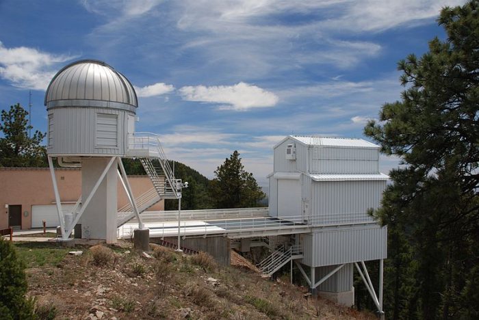
The Apache Point Observatory in New Mexico, where the Sloan Digital Sky Survey is located. (Wikimedia Commons)
On this planet, the Perimeter Institute is a leading centre of astrophysics. Working over 100 scientists from about 30 institutions around the world, it has been leading this project to map the universe that we live in.
It's a massive project—one that has taken about twenty years to complete. Scientists mainly used six years worth of data from a powerful device called the Sloan Digital Sky Survey (SDSS). Found at the Apache Point Observatory in New Mexico, the SDSS has been collecting images of quasars and other deep space phenomenon for years.
But this project—called the extended Baryon Oscillation Spectroscopic Survey, or eBOSS—presented the ultimate challenge. To map the millions of galaxies in our universe in relation to each other. Hey, no pressure!
What are we looking at?
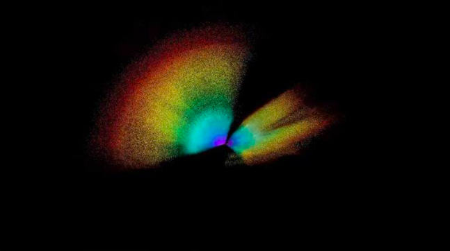
One angle of the 3D universe map. (Perimeter Institute for Theoretical Physics)
First off, if you find this map confusing, that's totally normal! It is unlike any map we've ever seen. And the place that it is trying to represent—the known universe—is a puzzle so complex that it regularly frustrates even the smartest minds in the world.
But here are some key points:
-
- Each dot is a galaxy: When we think of dots in the night sky, we think of stars. But every single point in this map is an entire galaxy that is itself made of billions of stars!
- Red shift: Describes what happens to super distant light sources on their way to us. As their light travels billions of light years to us, space distorts it, emphasizing the red light. In a nutshell, scientists can tell a lot about how far away a galaxy is by how its light is distorted. This fact helps them make a map like this!
- Far out: This map reaches about 13.8 billion light years into space. This is the limit of the known universe.
- Explosive sight: If this map kind of looks like an explosion to you, it's with good reason. Our universe was formed over 13 billion years ago in an enormous burst of energy called the Big Bang. Everything within the universe has been flying outward from that source ever since!
If you're not done being amazed and confused, watch the video below! It explains what this map is all about.


WOW!
soooooooooooooooooooooooooooooooooooooooooooooooo confusing